Reagena is going through a process of renewal in which digital business development will play a major role. As part of the renewal, Reagena’s corporate brand will be updated to reflect its future business. The company’s customers and partners are at the heart of the development. The corporate image will be renewed gradually throughout 2022.
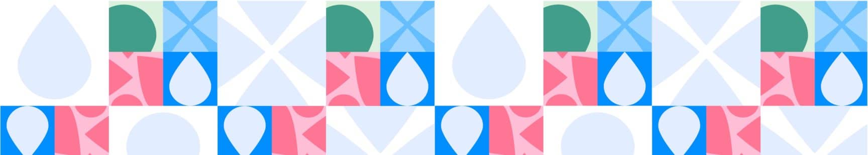
Reagena’s traditional logo has been given a new shape. The outer droplet in the logo represents our company’s innovation and growth, while the smaller droplet in the centre represents Reagena’s roots: we started small and we are expanding to become a larger international growth enterprise.
Blue will continue to be Reagena’s main colour, but it will be used in two shades. The blue colour communicates confidence and expertise. A new red colour in clean natural shades will also be introduced. In other regards, the visual identity seeks to retain the nuances and shades of Nordic nature. This is also reflected in the image themes associated with the new visual identity. The main themes are modern, fresh, and colourful images.
“Our industry is fairly traditional, and this is often reflected in the visual identities of companies in the field. We seek to stand out boldly by adding colour and strength to our brand. This reflects our forward-looking attitude – our desire to be open-minded and try new approaches. Our customers and market changes are at the heart of the development of our business.,” says Anu Mickels, Reagena’s CEO.
The new visual identity is already on our new website. We would be interested to hear your thoughts on our new look.